The King & McGaw development team uses a scrum-like process to manage the features we build. It looks a little bit like this:
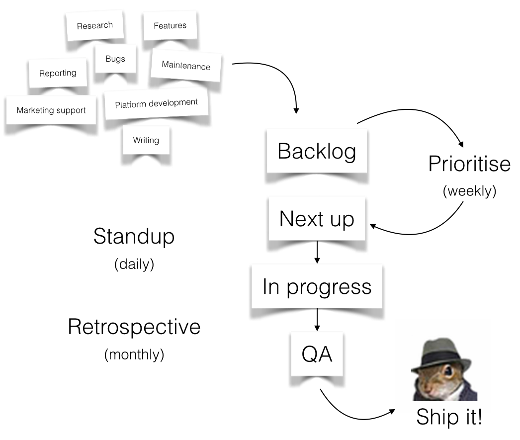
We’ve found this process to be super helpful for building things, but figuring out what to build is often more difficult.
“Everything is important”
- Difficult to prioritise business as usual (BAU) tasks against features when we have only one team
- Difficult to prioritise platform development (strategic impact) with features (customer impact)
- No procedure for researching the expected impact of a feature
- Difficult for development team to see what is coming down the pipeline
How we prioritise features now
Anyone in the company is allowed to add to the backlog, and at least once a fortnight we prioritise the features using this simple ranking system:

- Impact — expected creation or protection of revenue or other strategic objective
- Ease — the cost in man-hours to get the job done
The result is then multiplied by two and given a final percentage score (well, out of 98). Any task which is expected to have maximum ease (typically BAU tasks, less than 2 hours) can jump the queue and be scheduled for development at the discretion of the team. That’s it! Or is it?
What if we don’t have enough information to rank the feature?
If we can’t estimate the impact
- Data analysis! Extract the information you need from historical sales data, Analytics, server logs or whatever is appropriate
Clarify objectives with stakeholders, especially if it’s an internal requirement
- Model the expected outcome (“lifting this metric by x % will have this effect”)
- In any of these scenarios we will add a book icon (📚) until we have enough information to rank the feature.
If we can’t estimate the ease
- There are multiple ways to solve the problem, and perhaps a simple implementation will have less of an impact than a complex one so it also affects impact. Pick one, and rank based on that.
- The problem has not been defined well enough for the developers to estimate.
- In any of these scenarios we will have a small workshop to uncover the challenges and propose the most likely outcome.
It’s not perfect
Ultimately it provides us a good structure without being overbearing. It also means we need to be disciplined. If there is something we really believe in, but it doesn’t have a ranking which will allow it to be developed, perhaps we need to look at ways to make it easier, or to have a higher impact.
Leave a comment
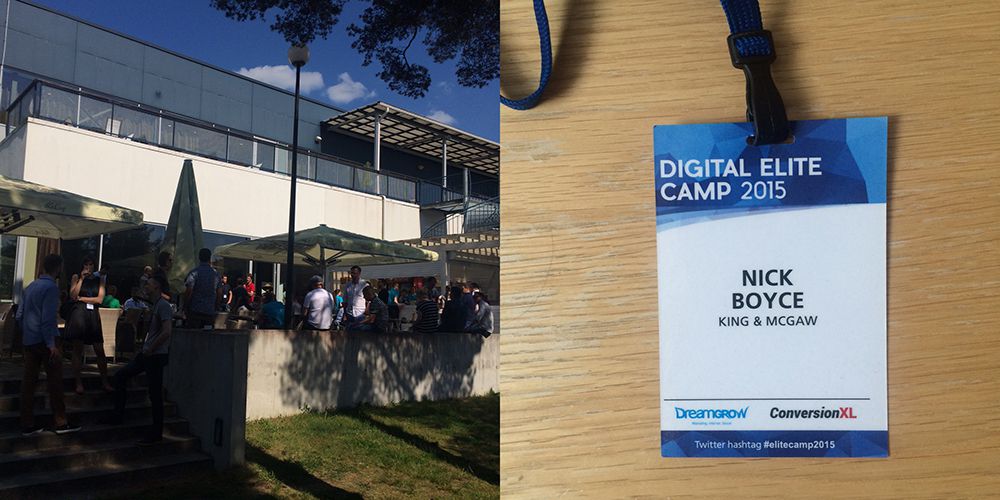
I’ve spent this weekend at Digital Elite Camp in beautiful Tallinn, Estonia. Peep, Ants and Priit have built a brilliant conference, and I was privileged to share ideas (and many beers) with smart, interesting people from all over the world. Here are some of the the themes that stood out for me.
Optimisation is people-driven
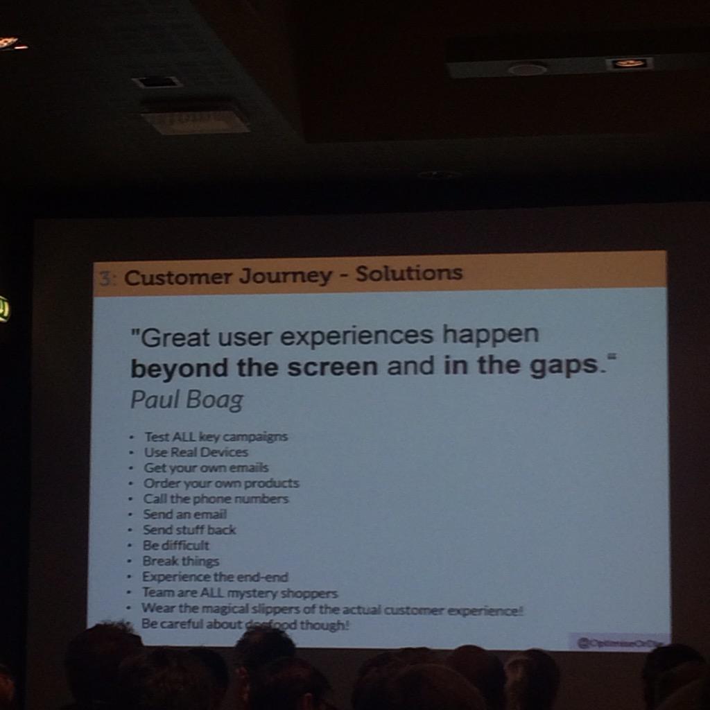
A common theme amongst the speakers was the importance of engaging with your customers as humans, in order to better understand their needs and motivations. Attempting to infer user needs from quantitative data can lead us to believe “what you see is all there is”, and hide important truths.
“The most important thing in conversion optimisation is the discovery of what matters” – Peep Laja
Getting away from data and speaking with the actual humans who pay your bills generates insights that help us design better hypotheses for improving user experience.
Conversion rate optimisation lies at an intersection between psychology, statistics and other fields, so there were many interesting discussions on cognitive biases, limbic mapping and persuasion.
Your conversion problems are highly contextual
There is no one-size-fits-all strategy for improving your conversion rate. Beware of generic advice on conversion rate optimisation, or conversion rates in general. It’s a process.
“Don’t copy your competitors, they don’t know what they are doing either” – Peep Laja
There was someone at the camp who had a 14% e-commerce conversion rate (he pulled out his Analytics app on his phone to prove it to me!), which is very impressive but completely non-comparable to our type of product (he sold contact lenses which are both necessary and need to be replenished).
“I’m not an expert, there are no experts” – Craig Sullivan
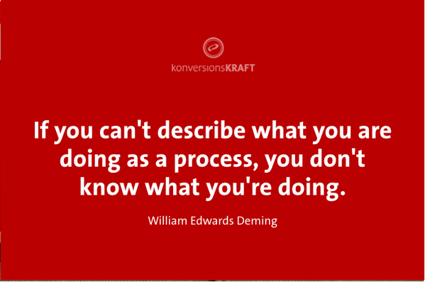
Process and culture should be created to maximise learning and discovery of what matters. It’s gruelling, unglamorous work, and in my experience it takes a number of cycles before the insights can start feeding back into hypothesis development.
Test planning and culture are vital
Too many A/B test “successes” are not statistically significant, therefore won’t translate to actual revenue when exposed to the real world. This was certainly the case for us in our early experimentations, but we are now disciplined about calculating sample sizes upfront and typically focus on specific funnel goals, rather than the e-commerce conversion rate.
I learned from Craig Sullivan that we need to make sure that we run the tests in full business cycles. Our customers follow a clear pattern which leads to Sundays and Mondays becoming our busiest days, so we should run tests in full weeks only.
Another great tip from Ton Wesseling is that you should slow down your control version so that each variation runs at the same speed.
There is also a lot that goes into building a testing culture. Test ideas come from qualitative and quantitative insights, not random marketing brainstorms. Outcomes from the tests create further insights and the cycle begins again. The more you know, the more you can know.
Email is a powerful channel
Your email database is one of the few channels you are in complete control of, and one I am guilty of not fully appreciating in the past. Noah Kagan, Brian Dean and Chris Hexton set me straight on that.
An effective strategy for transactional emails can lead to great results if they solve problems for the customer at the right point in their lifecycle. Airbnb and TripAdvisor have some killer executions in this area.
Re-sending to those who did not open will often get you a lot more people opening your mail (but you might piss some people off).
Recently I’ve been thinking a lot about when it’s OK not to convert. I’m happy to hear from most of the companies who market to me, yet most of the time I delete their emails without opening them (until I decide the time is right). I’m still happy to be reminded those companies exist.
CROs know to to drink!

Every night my head was full of ideas and my belly full of beer. I even won a bottle of mysterious Estonian liquor for asking the most questions!
I’ll definitely be back.
Leave a comment
A couple of weeks back, I was lucky enough to travel to Oxford to be amongst the 700 who attended jQueryUK’s 2015 edition. My first time in attendance, and my first time in Oxford in fact. Being a relatively new UK resident, this was also a delightful opportunity to explore the city on what turned out to be the nicest Saturday of the year so far!
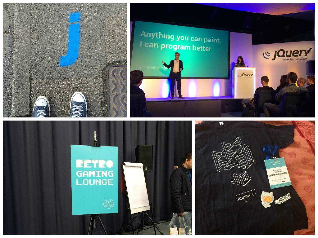
Hashtag jquk kicked off at a very reasonable 9:30am on Friday with the man himself, Dave Methvin (he runs jQuery or something) showing off some of the cool new stuff we can start taking advantage of in ES6, even if we have to support some browsers that are lagging behind.
Hot on his heels was the strapping Mark Otto, schooling us on the ins and outs of CSS organisation. As the current caretaker of the CSS at King & McGaw, there were some great takeaways here and I’d really recommend checking out the slides and the accompanying video.
It wasn’t just slide after slide of code all day though. There were plenty of great speakers just there to share the things they’re most passionate about.
Jenn Schiffer spoke about the intersection of technology and art, something that we’re obviously very excited about too. Jenn went about creating artworks in the styles of Mondrian, Magritte and Matisse using nothing more than JavaScript. They’re all part of her var t initiative check it out at http://vart.institute/, yes that’s a real TLD.
Addy Osmani nearly had to be dragged off stage while introducing some great new additions to Chrome’s dev tools. Things like the new colour picker, the animation helpers and the incredible Timeline Layers panel are going to be super useful for developers everywhere.
Through all of the technical talks, one thing shone through. Empathy. For users, customers, clients, coworkers. All of those that use the things we build. Improving performance shows respect for people’s time. Improving security shows respect for people’s safety. Improving usability and accessibility shows respect for people’s varied and ranging abilities.
To wrap everthing up, Ben Foxall did something on stage that can only be described as groundbreaking. Harnessing the power of all the devices in the room to create an immersive audiovisual experience piece. The audience gave a collective exhale and moved back into the main hall, where the night was filled with pizza, burritos, retro gaming and beers especially brewed by the sponsors.
A fantastic way to spend a Friday. 5 stars, would conf again.
Also, the videos for all of the talks have just been released. I’m off to watch all the ones I missed in person.
Leave a comment
Here at Easyart we are obsessed with speed. We constantly monitor the website’s dataflow from server response time all the way through to the end user experience. In our office, within view of the developers is a dashboard which immediately alerts us to any slowdowns or performance changes on the platform. 
We take advantage of the great tools provided by New Relic and webpagetest.org and pipe them through a Geckoboard dashboard.
During a recent “speed-up sprint” we got stuck in to the numbers to try and find where the bottlenecks were and what we could do to fix them. So we ran a few tests on one of our product pages using various browsers in a few different locations around the world (thanks to webpagetest.org). The results showed that we should be focusing on front-end performance rather than the server/database/back-end (more on that later).
")
That waterfall chart certainly doesn’t look like the work of a team who “are obsessed with speed”! Not to worry, that’s the purpose of this exercise. So time to roll up our sleeves and find out just what’s going on here. We try to adhere to best-practices by gzipping content, using a CDN for assets etc. But the problem turned out to be even more simple to diagnose.
Requests!
There were a whopping 140 requests with a total download size of 1.3MB. So it was decided that reducing these would give the biggest return on investment. It turns out that many of these requests were coming from 3rd party scripts which download further scripts and tracking images. In particular, the popular addthis.com sharing button was a serious offender. This information is good to know, but we can’t just go removing things without a discussion with the marketing department first. So that will have to come later. Let’s clean up our own back yard first.
Images and lazy loading
On our target page we are loading 16 “related prints” which means 16 requests. We decided to “lazy load” them, meaning they won’t download until the user scrolls down the page. Strictly this won’t have any effect on total download size, but it will free up the user’s bandwidth and CPU for other things. Such as the Backbone app that powers this page.
Backbone and lazy coding
In the Backbone app we have a modal which displays a custom framing interface, complete with dozens of framing options. We were creating this view - and downloading the images it containted - every time the app booted. But not every visitor sees this modal, so why waste the bandwidth?
The reason for this oversight is because in a previous design, the custom framing module was on the page, seen by everyone. But later it was moved into a modal, and the code wasn’t refactored with optimisation in mind. So by now creating the view on demand (user clicks the change frame option) we save a few more image requests. Lesson learned: when things change, clean up after yourself.
Modals should only appear when requested
Further down the page is more 3rd party code (ugh) which displays a widget of recent reviews. This code downloaded even more js code, some css and even a webfont! So we changed this to download on when requested (onClick). Then we found 2 more modals of our own that were hard-coded into every page waiting for someone to find the magic link that would spring them into life. It’s easy to code, but not very efficient. These were also changed to onClick events.
Sprite-ify all the things!
 The main “mega menu” for art Themes has 12 tiny thumbnails which represent each category. A prime candidate for a sprite sheet. This one change alone would save 11 requests at the cost of a slightly larger css file. But the trade-off is worth it. But why stop with these 12? We had a look at every site asset in the header/footer and elsewhere, and started adding them to the master sprite sheet. But as you may know, jpgs tend to be suited to photographic images and pngs work better for large blocks of colour and sometimes require transparency. So we decided to have the best of both worlds and make one of each (thank you Sprite Factory). This means two sprite requests, but better optimisation of the images themselves. Not to mention the quality of the images won’t suffer as much as they would if we tried to force a jpg-type image into a png.
Results
So what were the results of all this tuning and tweaking?
")
Speed Improvement
| |
Requests |
Download Size |
Time |
| Before |
140 |
1.3MB |
12.2s |
| After |
53 |
698kb |
3.2s |
| Diff |
62% |
46% |
74% |
Unexpected win
After the work was complete, tested and pushed to production and the victory celebration was about to start, we were alerted to the fact that Google Anlaytics wasn’t happy with the page speed! How could this be? Well the timing of this news was just a coincidence since it had nothing to do with the recent changes. What G was really complaining about was server response time. Something we blissfully ignored for this project. So back to New Relic to find the source of the problem.
What happened next could fill an entire blog post, but the long and short of it is: The amazing “Oj Gem”! Over 100ms saved on each and every JSON request from our back-end service.

Leave a comment
The great thing about being a web developer is that you get to learn new things all the time. This week, I learned something really simple, but it had a big impact:
iOS doesn’t respect event bubbling without a cursor style!
This amazed me. We have what we like to call popovers in various places on our main site, similar to these. Ours differ, in that we have a fullscreen, transparent div positioned behind them so the user can close them by clicking anywhere on the page. I discovered this wasn’t working in iOS.
The code looks something like this:
$(document).on("click", ".popover-overlay", function () {
    $(".popover-overlay").remove();
});
There didn’t seem to be anything wrong with the code and it worked everywhere else. We use similar looking code on other areas of the site and they were working in iOS. I was very confused at this point.
The difference between this specific example and the other places event bubbling is used was that the element we are targeting is not a link. It turns out that unless the element you are targeting has a cursor style applied, iOS won’t respect event bubbling.
After all that head scratching, the fix turned out to be:
.popover-overlay {
    cursor: pointer;
}
I couldn’t believe this. Especially as there is no visible cursor on iOS anyway!
Leave a comment